
When your business outgrows your logo
- Nov 17, 2025
- 3 min read
A founder’s guide to recognizing the moment you need to level up
Every business begins with a logo that reflects the early days of building something from scratch. Sometimes it is homemade. Sometimes it is designed by a friend. Sometimes it is the best you could do with limited time, limited budget, and unlimited hope. That first logo is part of your origin story. It represents the spark that pushed you into entrepreneurship.
But here is the truth most founders discover. Growth changes the way your business needs to communicate. The identity that felt fine in year one starts to feel incomplete in year five. It no longer captures who you are or the level of quality you have built. It is not a failure. It is a sign of maturity.
To illustrate this, look at some of the most iconic brands in the world. Their earliest logos often look nothing like what you see today.


When Apple launched, the original logo was a detailed illustration of Isaac Newton sitting under a tree. Beautiful but complicated. It was impossible to scale or apply across products. As Apple grew, the company simplified the mark into the clean shape we all recognize today. The brand evolved as the business evolved.
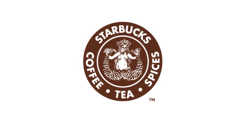
Starbucks followed the same path. The original siren was intricate and literal. As the company expanded beyond a single store in Seattle, they refined the logo into a simpler, more versatile symbol that scaled across cups, merchandise, and storefronts. The heart of the brand remained, but the expression matured.
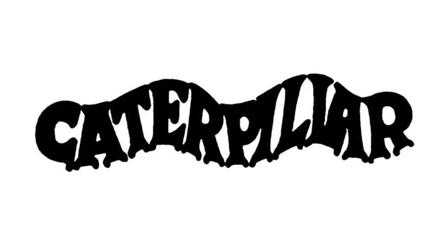
Caterpillar’s identity also shifted as the company moved from a machinery manufacturer to a global industrial brand. The early scripted lettering was replaced by a strong, confident wordmark that signaled durability and reliability on a global stage.
Target’s story is another example. Their first mark included multiple rings and typography that reflected the era. Over time they reduced the logo to a simple red bullseye. It became one of the most recognizable symbols in retail because of its clarity.
In each case the business outgrew the visual identity that supported its early days. The shift was not about chasing trends. It was about aligning the brand with the level of professionalism, scale, and confidence the company had achieved.

The same is true for founder-led businesses today.
You may be opening a second location, launching new products, or expanding your team. Customers expect more. Partners expect more. You expect more of yourself. When your work is polished and intentional, your brand should match that standard.
A modern identity does not erase your past. It honors it by building on the foundation you created. It keeps the spirit of your story but expresses it with clarity and purpose. The transition from a homemade logo to a professional brand is not cosmetic. It signals to the world that your business is strong, credible, and ready for its next chapter.
If your identity no longer reflects your capabilities, your growth, or your vision, you may be experiencing the same moment Apple, Starbucks, Caterpillar, and Target once did. Your business has outgrown its early symbol. That is a powerful milestone. It means you are building something real.
Your brand should show that. When your identity matches your level, everything becomes easier. Customers trust faster. Messaging becomes clearer. You present yourself with confidence. The brand finally reflects the business you have become.
Your early logo got you here. Your next one will take you further.


Comments